Internet Banking App UX
UX design for one of the world's largest independent financial advisory groups
Client
Leading multinational bank
Overview
One of the world's leading banks approached us to conduct an independent UX review of their internet banking app. This bank is consistently in the top 10 global investment banks and is based in over 40 countries across the world. For confidential reasons, we cannot use the name of this bank in our portfolio.
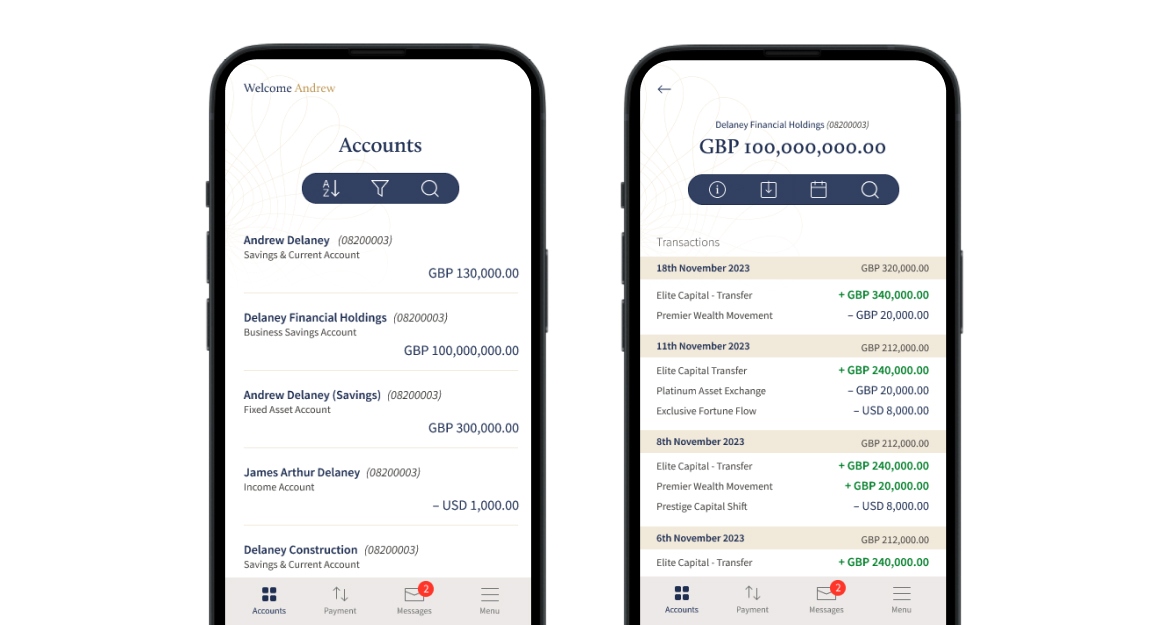
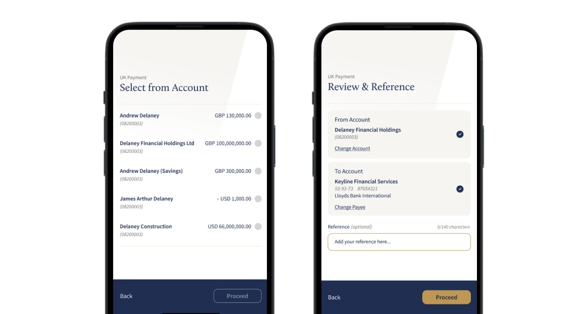
Our mission, to identify opportunities for usability enhancements and provide recommendations on how to align their app with a new set of brand guidelines they have produced. Each area of the app was broken down into mini reviews, including registration and log in, landing screens, account screens, moving money and messages. We then used a MoSCoW (must have, should have, could have, and won't have) framework to prioritise all of our UX recommendations.
What we learnt
There were several notable opportunities to enhance the usability and overall user experience of the application, with the following primary focus:
Improving the onboarding process
Onboarding is useful for web applications as it helps guide users through a platform, ensuring they understand its features and functionalities, which enhances user experience and retention.
Ensuring consistency in navigation
Consistency is important for user experience. When users are presented with a new screen, they should be able to quickly and easily find the controls they need. If the menu changes between screens, users will have to learn a new layout each time, which can be frustrating and time-consuming.
Streamlining workflows
Simple changes within key areas of the app make it more straightforward and easier to use. Reducing the number of steps during the registration process significantly improves user experience to simplify the process, minimsing cognitive load and reducing the error rate.
Content, creative and branding
From a design perspective, while the app conveyed empathy, it diverged from the new brand guidelines. There were also inconsistencies with WCAG 2.1 accessibility standards and the app did not reflect the premium band that our client wished for.
The outcome
Our UX review highlighted several areas that could be reviewed to improve UX. We grouped our recommendations into quick wins that could be made now and longer-term areas of focus that require a more in-depth review.
The end result was a roadmap of recommendations and a set of two new concept designs to visualise how they could improve the brand coherence and compliance across all digital channels.